


ARVIC Dashboard V1.0 - V2.0
The ARVIC Dashboard, developed in tandem with the ARVIC Application, aims to provide physicians and corporate entities with a streamlined platform to access and view health data and related medical records of their patients or employees. The project was initially launched as part of the NCDs behavior change tracking initiative at Bangrakum Hospital, where over 400 participants were involved. Additionally, the ARVIC Dashboard is designed with a white-labeling approach, allowing corporations to build an internal wellness support system through the ARVIC ecosystem, which includes the ARVIC App, Telemed, Symptom Checker, and ARVIC Dashboard.
Overview
Business Goals
-
The best interoperable health data platform that simplifies data access and accelerate the creation of health data network and ecosystem.
-
To build a health sharing ecosystem for both users and health services.
Issues
-
The health data and medical records are scattered.
-
There is no a medium for physicians or corporates to track data of patients or employees.
Key Tasks
-
Business requirement gathering, Stakeholder interview
-
Wire-framing, Lo-fi and Hi-fi prototyping,
-
Design system
-
Interactive prototyping
-
Usability testing

The ARVIC ecosystem comprises a flow of data sharing and storage, starting with the integration of electronic medical records (EMRs) from labs and hospitals into a personal "Health Drive" within the ARVIC Application. Access to the user's EMRs through the dashboard requires their consent, ensuring the privacy and security of their health information.

Problem Statement
"How might we help physicians or organization monitor health of their users anywhere and anytime?"
Ideation
The first phase of the dashboard's development focuses on the key concepts of "BE: Connecting Data" and "FE: Viewing Data", allowing doctors and corporate entities to access and view connected and shared health records. The team conducted stakeholder interviews to scope down the flow and features and identify common requirements among different clients. The result of this process was implemented as a minimum viable product (MVP).
Things In Common

With the initial features in hand, our team delved deeper to uncover common needs among various clients. We used this information to streamline our offerings and prioritize the most important features to develop as minimum viable products (MVPs). Despite ongoing stakeholder interviews, there may still be some unclear requirements from certain clients, but we're committed to clarifying all details through our engagement efforts.
Lo-Fi Prototype and Wireframe


The wireframe was a crucial aspect in laying down the structure and interface of the app, emphasizing on three main features: the dashboard, medical reports, and data visualization. These features provide physicians and corporate entities with the latest and up-to-date health data of their patients or employees, enabling them to make informed decisions in regards to treatment and care support.
Design System


The ARVIC Dashboard design system is based on Material design principles, but with custom components to match the branding of the ARVIC Application. In future, the design system can be refined to align with a corporate client's branding if they opt for the "corporate wellness package".
Prototyping V1.0
The Dashboard


The main dashboard, serving as the platform's main entrance, provides a high-level summary of various matrixes, including health risk analytics, feature usage, spending reports, and more. The dashboard page also allows users to filter data for a specific perspective, enhancing its customisability.
Visualisation


All health data of application's end users is is visualised into charts, graphs, trend, a detail of each parameters in time series, infographics, mini-infographics, charts, tables, timelines, scatter plots, or others. This feature helps physicians or corporates interpret data analytics results faster, recognise trends, and make better decisions for a treatment and care supports.
Health Medical Reports


Finally, the Health Medical Reports feature provides quick and secure access to patient records, improving coordination and efficiency in care. Sharing electronic information with doctors and other clinicians ensures effective diagnoses, reduces medical errors, and ultimately, provides safer care.
Use Case : Corporate Wellness

Corporate Wellness Package is the latest holistic B2B2C service to build up a transformational health support within a organisation and among employees. This package aims to optimise digitalised health solutions through providing Arvic application for end users and Arvic Dashboard for corporate monitoring. Besides, end users will be able to use all features of the application, especially Telemed and Symptom Checker, which are financially supported by the corporate for free. Also, annual checkup reports will be stored on Arvic platform for a better accessibility of both personal use and corporate tracking.
Corporate Health Card


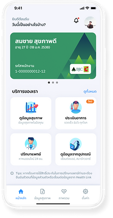
In the Profile section, the user can add a corporate code and an employee code to activate the free telemedicine and health welfare benefits. The user enters the corporate code and employee code, which are provided by the company HR department or benefits administrator. The application verifies the codes and confirms that the user is eligible for the telemedicine and health welfare benefits. Then, the personal health card will be turned into "employee health card" which the user is now able to access and schedule telemedicine appointments, view their remaining balance of telemedicine credits, and access other health and wellness resources provided by the company.
Telemed Credit Usage


The user navigates to the "Employee Health Card" section. In the Employee Health Card section, the user can view the balance of remaining free telemedicine credits. The balance information is displayed in real-time and updates automatically when a telemedicine appointment is scheduled and completed. If the user has any questions about the telemedicine benefit or their remaining balance, they can access help resources or contact support through the benefits app.
Pay by Wellness Credit


The user navigates to the telemedicine section and is presented with a list of available physicians. They research each physician and select one that best fits their needs.The user schedules an appointment with the chosen provider, either through the app. Then, the application submits a total expense for the telemedicine services, but the user is not responsible for paying any out-of-pocket costs as the services are fully covered by the employee welfare benefit.

Revamped Arvic Dashboard V2.0

Following the dashboard's launch in late 2022, our team decided to revamp its design. To facilitate this, we initiated usability testing to collect user feedback.
Newly Organized Filters
The key findings revealed issues with the filtering system, which consists of two levels: the master filter (concerning the year and organizational display of the entire dashboard) and the card filters. Users were confused by the master filters in the previous version, as they shared the same design as the card filters. The solution was to create distinct designs and placements for the master and card filters.
Newly Expanded Space
The updated dashboard version was not just aligned with the standardized MUI framework for design but also enhanced user experience. This was achieved by repositioning the main menu bar from the top to the left side of the screen, allowing a larger area for data display.
New Modern Design
The modernization is also evident in the updated color palette and the application of Material UI conventions, which bring a fresh, contemporary look while improving interaction design. This approach enhances the user experience by providing a more intuitive and cohesive environment, where the visual hierarchy is clear, and the functional elements of the dashboard are accessible and user-friendly.
The revamped design of the dashboard embraces a modern aesthetic that prioritizes clarity and ease of use. With the introduction of distinctly differentiated master and card filters, the design ensures that users can effortlessly navigate between filters that impact the entire dashboard and those that apply to specific sections. The master filters have been visually and spatially separated from the card filters, simplifying the user interface and reducing confusion.
The design retains its familiar structure to ensure a smooth transition for existing users, while the improvements demonstrate a commitment to staying current with the latest design trends and user experience best practices. This balance of innovation and consistency is key in offering a product that is both forward-looking and reliable.
Standardized Design System


Standardized Design System
The redesign of the Arvin Dashboard was carried out in mid-2023, aligning with Cariva's initiative to standardize the design and development of their products using the Material UI framework. This necessitated a revamp of the project to ensure consistency with the new direction.
Redesigned Main Dashboard


The Dashboard
The recent update to the dashboard design maintains much of the structure from the previous version, but introduces a revamped filtering system. This new system distinctly separates the master and card filters, making it easier for users to identify and prioritize which filters impact the entire dashboard and which affect only specific sections or cards.
Redesigned Medical Reports


Medical Reports
The overall design of the medical report remains unchanged, maintaining its original layout and content. However, there has been a notable update in the design of the tabs, which have been modified to align with the Material UI framework. This change ensures a more cohesive and consistent user interface, enhancing the overall aesthetic and functionality of the report while preserving its familiar and essential features.
Redesigned Visualisation


Visualisation
The design of the visualization page and its charts has been largely preserved, maintaining their original layout and structure. However, these elements have been updated to incorporate a new color scheme and modal designs that are in line with the Material UI framework. This enhancement ensures visual consistency and alignment with the latest design standards, enriching the user interface experience while keeping the familiar and effective functionality of the visualization page and charts.
